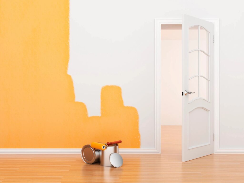
Choosing the perfect paint colour for your space can be both exciting and daunting. The seemingly endless array of shades on the colour spectrum can leave anyone feeling overwhelmed. While most people focus on the basic colour, like blue or green, there’s an essential aspect that often goes unnoticed but plays a crucial role in the overall aesthetic – undertones.
Understanding Undertones
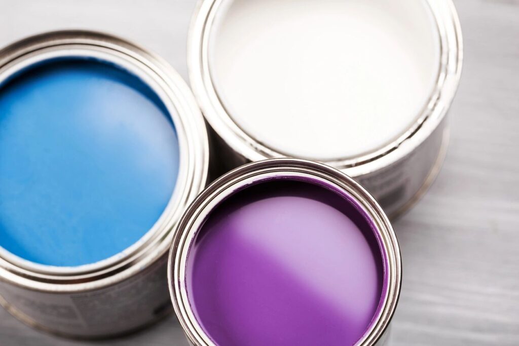
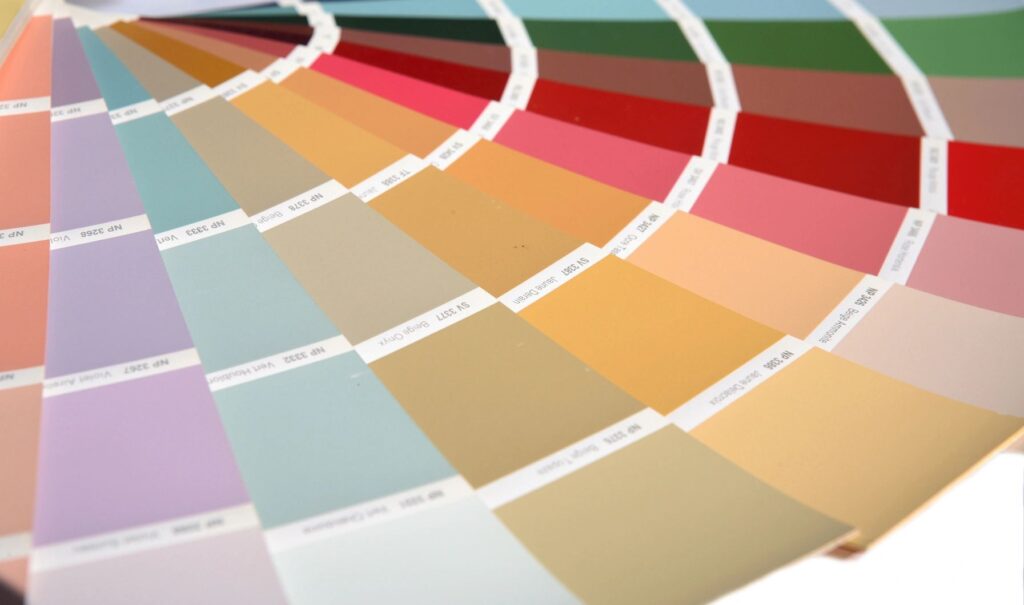
Undertones are the subtle, underlying tones that influence the overall feel of a paint color. Even if two colours look similar at first glance, their undertones can make a significant difference in how they appear on your walls. Undertones fall into three main categories: warm, cool, and neutral. Identifying the undertones in a paint colour can help you create a cohesive and harmonious look in your space.
Warm Undertones
Warm undertones are associated with colours that have a hint of red, yellow, or orange. Think of the warmth of sunlight or the golden hues of autumn. Colours like beige, tan, and certain shades of white often have warm undertones. These colors can create a welcoming and cozy atmosphere in a room, making them ideal for living spaces and bedrooms.
Cool Undertones
Cool undertones are linked to colours with a touch of blue, green, or purple. These colours evoke a sense of calmness and serenity, reminiscent of a clear sky or a tranquil ocean. Blues, greens, and grays are typical examples of colours with cool undertones. Using colours with cool undertones can make a space feel fresh and relaxing, making them suitable for bathrooms or offices.

Neutral Undertones
Neutral undertones are a blend of warm and cool tones, making them incredibly versatile. Colours like beige, gray, and taupe fall into this category. Neutral undertones can adapt to various colour schemes and design styles, providing a timeless and elegant look. They serve as a great base for any room and can be paired with both warm and cool accents.
Tips for Choosing the Right Undertones
- Consider Lighting:
Lighting can affect how undertones appear in a space. Natural light and artificial light sources can influence the perception of colour. It’s essential to test paint samples in different lighting conditions to ensure the undertones complement your design vision. - Test Samples:
Never underestimate the power of paint samples. Paint a small section of your wall with the chosen colour to see how it interacts with the lighting and existing elements in the room. This hands-on approach allows you to make an informed decision. - Coordinate with Fixed Elements:
Consider the undertones in fixed elements like flooring, cabinets, and countertops. Harmonizing these undertones with your paint colour will create a cohesive and unified look in the space.
Undertones may be subtle, but they play a crucial role in the overall impact of a paint colour. Understanding warm, cool, and neutral undertones can guide you in creating a harmonious and visually appealing environment. So, the next time you embark on a painting project, pay attention to the magic of undertones – it could be the key to unlocking the perfect palette for your space.